

Football analytics should make video analysis more focused
Football Hacking was created around a simple idea: analysts, coaches and technical staff should not have to watch every minute of every match blindly, hoping that an important tactical pattern eventually reveals itself.
Video remains essential. No graph, model or football analytics platform can reproduce everything that happens on the pitch. The timing of a run, a player’s body orientation, the pressure applied by an opponent and the space created for a teammate often need to be seen.
But that does not mean the analyst should always begin with a blank page.
The more tactical information we can extract from football data before watching the match, the more intelligently we can use video. If a graph already indicates where a team may be building, which players connect different areas and where certain players tend to receive the ball, the analyst can concentrate on the deeper questions.
Why is that player moving there? What triggers the rotation? Which teammate occupies the space he leaves behind? Does the movement attract an opponent, create a passing lane or prepare the next progression?
This is the philosophy behind Football Hacking: use data to identify the questions worth investigating, then use video to understand the football behind the numbers.
A new player movement visualization
With that objective in mind, I am currently developing and testing a new tactical movement graph for the Football Hacking web app.
The basic concept is straightforward.
Each player is positioned according to the average location from which he makes his passes. From that reference point, dotted arrows indicate the main areas in which he tends to receive the ball.
The arrows are not passing connections. They also do not claim to reproduce a player’s exact run from one point to another. Event data cannot provide the same level of physical movement information as optical or GPS tracking data.
Instead, the visualization compares two different positional signals:
Where does the player usually release the ball?
Where does he tend to appear when receiving it?
The difference between those locations may reveal functional movement: a defender stepping into midfield, a full-back moving inside, a midfielder dropping into the first line, a winger receiving in different corridors or an attacker changing height during possession.
It is a way of transforming passing and receiving locations into tactical hypotheses.
From a graph to a better video question
The image attached to this email is one of my current internal tests. The labels are still in Portuguese because this is an early prototype that I am validating before deciding whether it should become a new Football Hacking web app feature.
One possible interpretation immediately caught my attention.
In the section of the match represented by the graph, Arsenal appear to be building with three players in their first line.
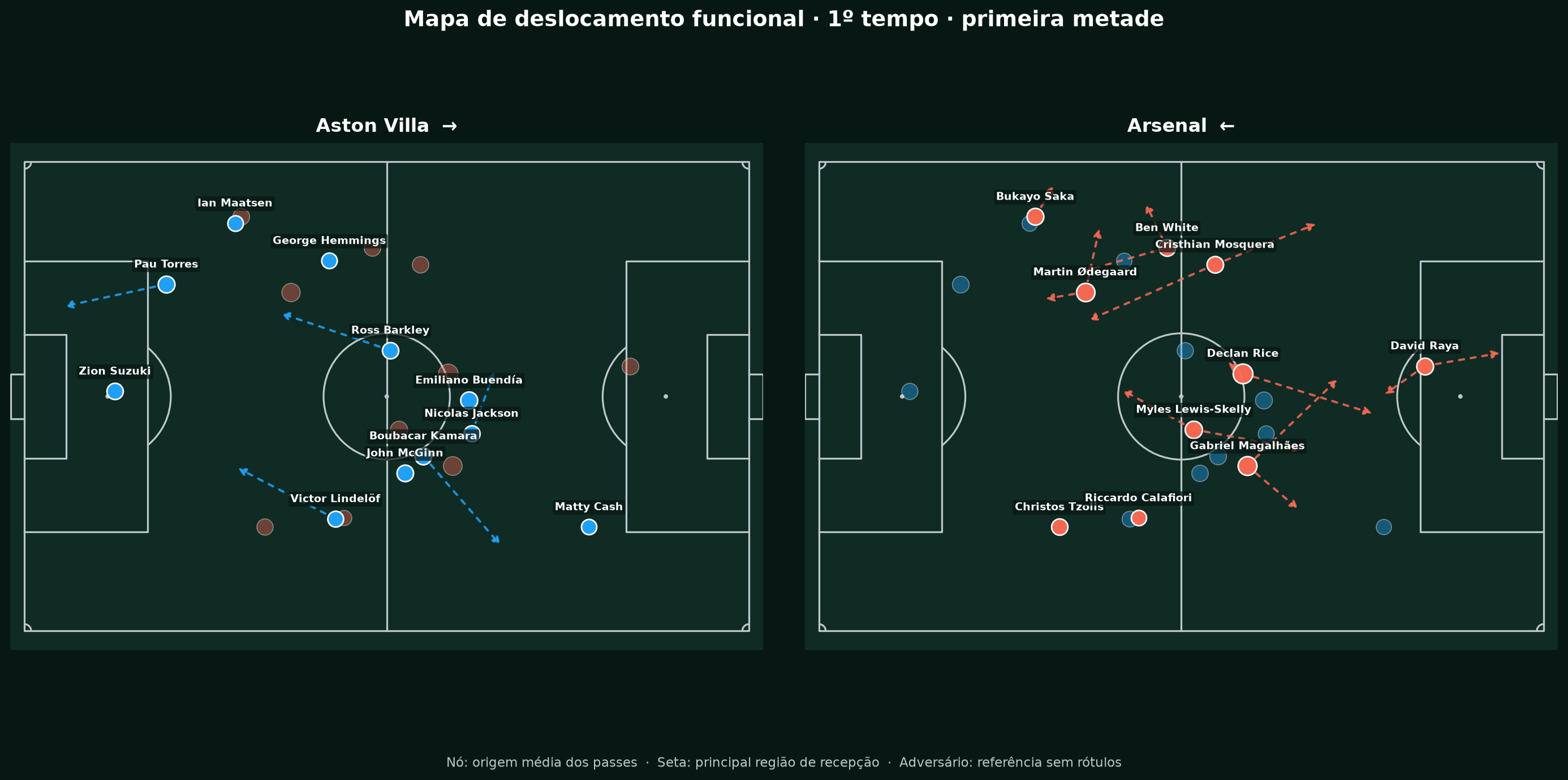
Is Arsenal really forming a back three during that phase? Is one full-back staying deeper? Is a midfielder dropping between or alongside the central defenders? Is the apparent structure stable, or is it only the result of a few isolated possessions?
The graph cannot answer all of those questions by itself—and it should not pretend to.
What it can do is tell me exactly what to investigate when I open the match video.
Instead of watching a long sequence without a specific target, I can go directly to that period and verify whether Arsenal consistently use a three-player build-up structure. I can then examine how the opposition reacts, where the free player appears and what happens after the first line is broken.
That is the workflow I want Football Hacking to support:
Data identifies the possible pattern. Video confirms, rejects or explains it.
Even if the hypothesis turns out to be wrong, the visualization has still served a purpose. It has generated a precise tactical question that can be tested against reality.
Reducing screen time without reducing analytical depth
For analysts and coaching staffs, time is one of the most limited resources in football.
A professional may need to examine several matches from the next opponent, review his own team, prepare individual clips, evaluate set pieces and communicate the findings to coaches and players. An enthusiast may face a different schedule, but the challenge is similar: there is far more football available than anyone can examine deeply.
The objective is not necessarily to watch less football for its own sake. The objective is to avoid spending valuable time searching blindly for patterns that data could have highlighted first.
If an analyst needs to watch fewer matches—or watch the same match fewer times—to understand its basic structure, that time can be invested in details that demand human interpretation.
The analyst can focus on pressing triggers, cover shadows, body shape, synchronization, player intentions and the opponent’s responses. In other words, the elements that are difficult to capture with event data alone.
A useful football analytics tool should not compete with the analyst’s knowledge. It should make that knowledge more productive.
Why this is still an experiment
I am not presenting this visualization as a finished metric or a confirmed web app feature.
I am currently testing different matches, teams, match periods and tactical contexts. I also need to compare what the graph suggests with what actually happened on video.
That validation is crucial.
A visually convincing graph can still produce a misleading interpretation if its assumptions are not tested carefully. Before adding this visualization to Football Hacking, I want to understand where it works, where it fails and how much confidence we can place in the patterns it highlights.
I am also evaluating how the graph responds to substitutions, red cards, extra time and changes in possession structure. Set-piece situations are excluded because corners, free kicks, throw-ins and goal kicks can distort the open-play positional picture.
The goal is not simply to create an attractive graphic. It is to create something that genuinely helps people understand a match more efficiently.
Building Football Hacking around better questions
This prototype represents the direction I want Football Hacking to continue exploring.
Football data should not merely describe how many passes a player completed or where he touched the ball. It should help us move closer to tactical interpretation.
Where does a player operate? Where does he reappear? How does his position change during possession? What structure might the team be creating around those movements? And, most importantly, what should we look for when we return to the video?
The answers will never come from one graph alone. But a strong visualization can reduce uncertainty, guide attention and allow analysts to begin their video work with better questions.
That is what I am testing now.
The attached image is only a prototype, and the Arsenal interpretation still needs to be checked against the match itself. I wanted to share the process because Football Hacking is not only about presenting finished results. It is also about developing new ways to connect football data, tactical analysis and reality on the pitch.
If the validation proves that this graph consistently produces useful and reliable insights, it may become one of the next features available inside the Football Hacking web app.