
Manchester United After Amorim: What the Data Says About the Carrick Effect
From transition to transformation: what the data really shows.


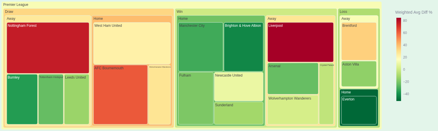
If you care about football beyond narratives and headlines, this is one of those moments where the numbers actually tell a fascinating story. Manchester United’s 1–1 draw against Leeds United marked the end of Rubem Amorim’s stint and the beginning of a new chapter, first under an interim setup and then under Michael Carrick. Since then, something has clearly shifted. The eye test hints at it. The table suggests it. But today, we’re going to do what really matters: follow the data.
All the metrics you’ll see discussed here were extracted directly from my MongoDB database and processed and analyzed using Python. No vibes. No highlight clips. Just structured, reproducible analysis. And if you want to explore these numbers interactively, with filters, comparisons, and intuitive visuals, make sure to visit the Football Hacking web app. It’s the fastest way to turn raw football data into real insight.
Before we dive in: if you enjoy this kind of deep, data-driven football analysis, consider subscribing to the newsletter—especially the premium tier. That’s where I publish the most detailed breakdowns, methodologies, and experimental metrics you won’t find anywhere else on the internet. If you’re serious about understanding the game through numbers, that’s where you want to be.
Now, let’s talk about what actually changed at Manchester United.
The Context: Same Squad, Different Signals
Managerial changes often come wrapped in emotional narratives: “new energy,” “fresh ideas,” “a psychological boost.” Sometimes that’s true. Sometimes it’s just noise. The only way to separate signal from storytelling is to look at performance indicators that describe how a team plays, not just what the scoreboard says.
In this article, we’ll focus on a few core pillars:
xG from open play per 100 passes and its balance (for vs. against)
Percentage of passes in the opponent’s half
A split-sample comparison: matches with Amorim vs. matches without him
Weighted Relative Performance, a custom metric I created
Poisson-based probabilities for scoring and conceding 2+ goals
Expected Threat (xT) and Load Centrality in the debut against Manchester City
Again, all of this comes from my own MongoDB database, cleaned, transformed, and analyzed in Python. If you want to explore these dimensions team by team and match by match, don’t forget to check the Football Hacking app.
United at the Top in Open-Play xG per 100 Passes
Let’s start with one of my favorite productivity metrics: xG from open play per 100 passes. Instead of just asking “how much xG does a team generate?”, this metric asks something more interesting: how efficient is a team at turning possession into danger?
Right now, Manchester United sits at the top of the Premier League in this metric. That alone is striking. Even more striking is that they’re also performing very well in the balance of this same metric—meaning the gap between what they create and what they allow is strongly positive.
In practical terms, this suggests two things:
United are generating high-quality chances relative to the amount of passing they do.
They are not allowing opponents to do the same at the same rate.
